Making competency assessment simple
Helping applicants complete skill assessments with confidence
Client
Financial regulatory body
Team
Project manager
Developer
Role
Product design, product strategy, usability audits, backlog development
Result
A 50% reduction in development time and an improved product that led to a successful pilot

Barriers to assessing competency
For those pursuing a career in accounting, being able to describe the competencies you've acquired on the job is a necessary but often tedious step on the path to certification.
Our client’s goal was to help applicants easily self-assess and document their competencies to make the application process less intimidating. A developer on our team took a first pass at converting a PDF form to a web-based tool using Microsoft low-code tools, but the client recognized there were some major usability improvements needed before they were ready for a pilot. I was brought in to get this tool pilot-ready in just a couple weeks.
In scope
Main landing page
Overall organization and structure of steps
Minor custom coding
Microcopy
Out of scope
Content of individual forms
Primary research with target users
Web copy and messaging
Fully custom-coded features
Just enough research
The developer and I shared a pool of hours and the timeline was firm, so I had to hit that sweet spot of just enough research and validation to achieve a solid design.
I started with stakeholder interviews to walk through the form, unpacking what prompted the ask for redesign.
Next, I conducted a usability and accessibility audit, and design reviews with the client and my design peers as the design progressed. In the absence of target user feedback, I relied on our industry’s body of research and tested best practices to ID and prioritize usability issues.
What research revealed
Reliance on text-heavy instructions
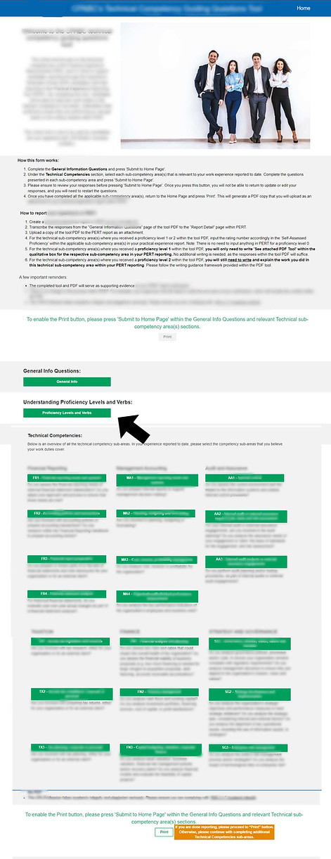
On the homepage, the user was met with a wall of text above the fold providing instructions on how to complete the form to compensate for a structure that wasn't intuitive.
At the same time, a critical guide to proficiency levels was formatted like an additional subform below the fold, and only available to the user on the homepage.
Screen shot of original single-page form.
Overwhelming subforms
The user was met with 23 buttons corresponding to different form sections. It was unclear how many sections were required, where to start, what ones were complete, or what was remaining.
Error-prone interface
In the original form, it wasn’t clear to users until submission if they had made incompatible choices or missed basic requirements for the form. They weren't delivered error messages about missing requirements until after they went to generate the PDF. Since the form didn’t save their information, they could also lose their work if they navigated away from some pages and weren’t warned of this fact.
How we tackled it
Delivering information gradually, and showing visible progress
I decided to manage the complexity through progressive disclosure of information, proposing a wizard structure to guide the user through an ordered flow.
I divided it into four screens, starting with the instructions followed by the mandatory employment information section. I included a progress header that clearly indicated their status as they went.
For the more complex technical competencies section where the user had to choose from a number of forms to complete, I proposed nesting the numerous form options under themes so the user could expand on just the skill areas relevant to them.
I distinguished completed sections from ones they hadn't started so they could see progress at a glance. I also proposed a progress indicator dial so the user could clearly see how close they were to meeting the minimum requirement without having to expand sections.
This immediately reduced cognitive load by providing a clear order of steps, reducing the information presented at once, and showing visible progress.


Providing relevant, timely guidance for correct completion the first time
Initially the client wanted review of the proficiency levels guide to be its own distinct step. However, I realized that this step required no action from the user, and if we placed it at this stage, the user could not reference it while completing other sections.
I advocated to remove the proficiency guide review as a step in the wizard, and instead include a link available across steps that kept the guide readily available across tasks.


The developer and I also worked together on the logic so that if the user didn’t meet the requirements in a stage they couldn’t progress, saving them from wasted effort.
Where we had to compromise
With the rigid functionality of Power Apps and extremely limited budget to spend on more custom workarounds, we had to be a bit creative and let go of some of the finer points of the experience.
-
Clickable tabs became simplified buttons due to limitations in Power Apps.
-
We had to drop the high-level progress indicator showing the technical competencies remaining.
-
Since the form wasn’t tied to any user account and just produced a PDF download, we leveraged local web storage that would persist across browser sessions to preserve progress.
-
I created a prioritized backlog of features to help the client prioritize; providing recommendations on which features were critical to the pilot, and the ones that could be pushed to the next iteration.
Outcome: A successful pilot
We delivered an improved solution on time, and under budget, as well as a prioritized backlog of future improvements they could make. The client was delighted with the result.
The developer, who had not been able to work with a product designer on low-code projects previously, said I cut his typical development time in half through my mockups and iterative design reviews, saving him from having to rework features already developed.
The client piloted the form with the changes and reported very positive feedback from the first pool of participants.